I've been toying with several options for our new company animation title. When you're too lazy or possess a creative brain about the size of a peanut (like mine) , the best thing to do is get ideas from tv or movies or items that can easily be 3d modeled. Hmm: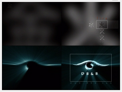 First one. Crap.. Very basic, with all that overused glow effect.
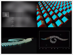 Concept lifted from mahjong cubes. Ech... Logo didnt look too good from the top view.. But the domino effect is quite ok.
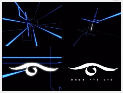 I was trying to do a TRON effect here.. but the boss didn't like the logo smashing into pieces.. haha.. Too bad cos TRON was like one of the coolest CG movies ever. The other one is Flight of the Navigator. I think I'm digressing.. moving on:
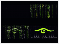 Does this mean my company is a machine world where they control all their workers inside their own matrix..? Who cares.. this I'm sure is the most overused title concept ever! The Wachowski brothers have moved on from their inferior Matrix Revolutions, so shall we..
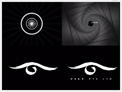 Hmm.. a 007 effect..? Casino Royale influences?? Duh.. why not do a concept with dancing penguins as well?
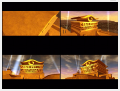 What the hell..?? Copyright issues man! :D
Ok.. zeroing in on a concept.. (drum roll)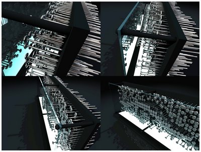 Whoa! this is nice.. concept similar to that Nine Inch Nails' "Only" video.. Albeit a poor reproduction.. But the pulsating nails are cool..
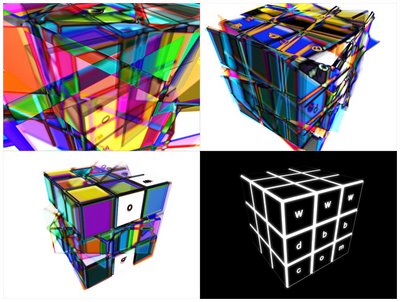 Well, ended up with this concept. And no movie influences I can think of.. :D It's really straightforward, an animated rubiks cube done in 3DS Max, overlaid several times in post processing, time delays with inversed colors. Graphic geeks, you should get the idea. :D Good thing our website url fits perfectly on those 9 faces..!
Friday, November 24, 2006
3D Post No. 8 - Animatics
Subscribe to:
Post Comments (Atom)

2 comments:
i feel...like the first one best....and...the fifth one...i cant help laughing when seeing it.....ur so...^^
How abt ask all dbbian to vote on all these styles...hehe
I personaly like the zeroing effect. V-ray or toon style rendering?
ya...is Kuik here. feel good to visit ur blog. Cheers!
Post a Comment